Book Report: THE CLIP-ON METHOD

By JASON PICKLEMAN
THE CLIP-ON METHOD by Cady Noland is the most significant artist book to be published by a living artist within generations. If you want to know why, keep reading. If you don’t, unsubscribe.
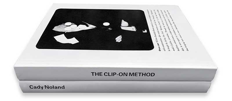
Measuring 8.5 by 11 inches, the standard size 2-volume book belies its complexity with a format that appears to be generic, but is in truth much more. Comprised primarily of black and white reproductions of Noland’s work and related texts selected by the artist, the book acts as archive, overview, reader and syllabus.
THE CLIP-ON METHOD’s two volumes can be picked up and read in any order: back to front, front to back, start in the middle. Doesn’t matter. The net result is the same. The volume with the words “Cady Noland” on the spine is 306 pages; the volume with “THE CLIP-ON METHOD” on it’s spine clocks in at 290 pages. Both books commence their page numbering (their pagination) with the cover, an uncommon design-sleight-of-hand. Within the body of each book, page numbers appear only on the left hand pages, always in the lower left hand corner; 3/8-inch from the left trim and 1/2-inch above the bottom trim—an elegant proportion. They, along with most of the original body copy, are set in an innocuous typewriter-like font.
THE CLIP-ON METHOD, simply put, is a book made from photographs of Noland’s artworks, often shown within their first installations and, one would assume, arranged by the artist—an important distinction that adds both subjective gravity and artistic personality to each page layout. Noland’s primary materials are on display throughout the book (fencing, pipes, poles and rails; aluminum walkers, crates, and metal baskets; newspaper clippings, flags and beer cans) and are seen aggregated, arranged and assembled, equally menacing and left akimbo. Leafing through these pages feels like viewing Noland’s work through her eyes alone, on the artist’s terms: resolutely displaying the way her abject materials add an unnerving energy to the rooms in which they are installed. There is an experiential energy to the reproductions and texts, as scale and placement on the pages shift with a seeming disregard for rules or grids. The layout sings of an artist’s voice, not a designer’s voice.
Physically, the two soft cover volumes feel hefty, weighty in the hand and lap. The body of each book is printed on a dull-finished paper, most likely an 80# text weight sheet with decent opacity that appears to be around 94%. The covers of each book utilize what feels to be an 18pt C1S cover weight sheet. The front cover has a soft, supple feel compared to the uncoated feel of the inside-front and inside-back covers. Both back covers are blank—indicative of an elegant reserve common to both volumes.
As Noland’s artwork can sell in the millions, and as this book is presumably an artist/publisher-funded venture, the production team could have afford anything in terms of printing: case bound hard cover, head and tail bands, pasted end sheets, fly sheets, inserts, fold outs, die cuts—you name it, they could have afforded it, and yet all such bibliographic extravagances are not to be had in THE CLIP-ON METHOD. Still, the book is luxurious.
One of the most interesting stylistic decisions of the books’ design is that artwork reproductions exist without an image caption near them. All caption citations are combined at the back of each book, and are listed across a 2-page spread in vertical columns delineated by date, title, page number, and location—in that order. All artwork titles are presented in ALL CAPS, with any lengthy two-line title indented 1/2-inch on its second line. The same indentation rule applies to the location citation when needed. As this list traverses across the gutter of the book and onto its facing page, horizontal alignment is of paramount importance. To wit, the printing and bindery by Graphius in Ghent Belgium is second to none. If you need an art book printed, call them, but be prepared for no response, as my inquiries to them regarding certain printing specifications of THE CLIP-ON METHOD went unanswered.
It’s not unusual for an art book to note its print run within its colophon. My inquiries into this number also proved futile, thwarted by the publishers’ democratic impulse to remove the idea that the books’ print run become precious. Released in 2021, THE CLIP-ON METHOD is already on its second printing and costs $65 USD; the same price as the sold-out first printing. My guess is the second printing may not even note “second printing”: a move to deincentivize re-sale, price hike, or covetousness. Kudos to the publishers Rhea Anastas, Robert Snowden, and the artist herself.
The meat of any art book are the reproductions of the artwork, and THE CLIP-ON METHOD delivers with abundance. In total, 168 images of Nolands’ art are reproduced; but uniquely only 9 are printed in color. Again, for an artist that can presumably afford anything, this can only be read as a conceptual hedge, like hiding a royal flush with only a single card showing. Instead of this appearing as a deficit, the black and white reproductions come across as original testament. I’m told the black and white images were printed with two black inks, giving them a depth and tonal evenness despite their apparent economy of reproductive means. When a color reproduction is introduced, it’s almost startling.
Over her exhibition career, Noland participated in the photography of many of the works, and a considerable number in THE CLIP-ON METHOD are shown in-situ. Many are shown multiple times, from various angles, and not necessarily placed chronologically within the book(s). Noland’s work at the legendary New York gallery American Fine Arts is, for example, presented 17 times. Had this number been doubled I wouldn’t have minded, nor probably noticed. Each photograph bears witness to sculpture as historic documentation while acting as forensic evidence. Some of the photos are “bad”: blurry or off center. A few are turned 90-degrees. Some of them are a bit dark and with an excessive grit or grain. Some of the images are reproduced to show their physical source: 35mm slide, 4x5 transparency, lab print, or existing offset reproduction. The sequence of the images was arranged by Noland and, since they unfold devoid of strict chronology, rely on an intuitive visual rhythm wherein graphic or conceptual presence supersedes annual sequentiality. An image from 1989 might, for example, be followed by one from 1995 and then followed by one from 1988, then 1999, then 1993, then 1989 etc. What is strange is that this bouncing chronology is generally unnoticeable: that is, unless like me, you find yourself psychotically flipping to the back of each book to reference dates and locations. With scant regard for chronology, the layout invites an experiential immersiveness. The sequence and scale of the reproductions rely on few design rules: relying instead on the artist’s intuition to guide the reader through an encounter with the materials which, as mentioned, are often shown in their first presentation. I’ve been told the layout was done analog, by hand, by Noland herself. Only in the late stages of the layout was the project given to the designer Will Holder for re-composition within Quark Express, an unusual, and now uncommon, choice in digital layout software for book production.
One of the most extravagant design gestures within THE CLIP-ON METHOD is the unconventional use of blank pages as frequent pauses to the design narrative. Not only might an image on the left-hand page face off with a blank right-hand page, but a subsequent 2-page spread might contain no text, no image, no page number whatsoever: nothing at all. This is the sort of design move that only an artist can get away with. Designers may try to rationalize the use of “negative space”, but only an artist can in negating space create drama and reprieve in service to the framing and focus of image and content. Thank you for nothing.
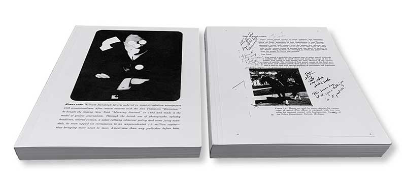
Beyond the images, both volumes contain significant re-prints of existing texts: some by Noland, like her “NOTES FOR 1989 SHOW” and her “Towards a metalanguage of Evil” (the latter in both English and Spanish); and others reproduced via full page scans that look as though the books from which they came were plopped down on a photocopier, with any grime on the glass transferred and repeated. Along with the many installation reproductions, the nine reprinted sociological essays cast a shade of paranoia, manipulation, and since this is Noland, the despoiling of the American project—from corporate industries’ disregard for product safety (the explosive Ford Pinto) to the administrative blind spots of minority recruitment in higher learning (Stephen N. Butler, to whom, along with Noland’s mother Cornelia Ries, this book is dedicated). Texts entitled “Night as Frontier”, “Freak Shows and Talk Shows”, and “Paranoid Style”, might even act as surrogate titles to Noland’s artwork. Truth be told, these essays are a heavy slog, and require a concentration in direct proportion to the immediate gut-punch of Noland’s artworks. The reproduced book covers for each essay might even be construed by some as de facto Nolands.
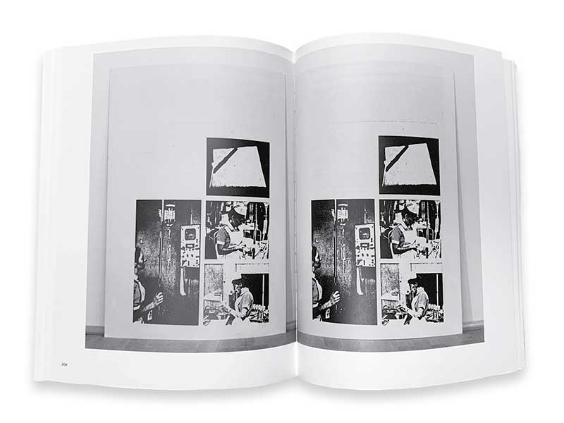
It’s been well noted that Cady Noland’s artworks exude an unrelenting cavalcade of menace from what appear to be store bought or cast-off items. The artworks invoke a sense of violence, deviance, and degeneracy; power, control, and manipulation; anxiety, paranoia, and aggression—not always in that order. Yet, the artist states that the works are not risky or subversive. To my mind, if they are anything, they are uniquely American. We get what we deserve: aluminum walkers as sculpture; metal railings as prison bars; walls of Budweiser as a stand-in for America herself and the arenas of her spectacle. The 2-volume collection is the perfect vehicle to contain such an inventory: an artist’s archive more than a catalog raisonné. And for those of us with our ears to the ground, the inclusion of three images dated 2021 reproduced on pages 182-83, 196-97, and 208-09 of the “Cady Noland” volume offer a ground shift for those unaware of any work from Noland dating post-1999. When I inquired, I was told “these are drawings reproduced in the books’ pages, their published form is a work.” Which brings me back to why THE CLIP-ON METHOD is such a remarkable book. Not only does the work present an archive of materials, but it notes that the archive is alive and growing, as every living artist’s work should. Few artists within the last fifty years have so poignantly dreamed, and damned, the United States of America as vociferously as Noland. THE CLIP-ON METHOD is a great book because it is true to itself. The book does not try to be like other art books by other artists; it is a book about Cady Noland, by Cady Noland, and it looks like a Cady Noland. Artists: take note.
